
The aesthetic of an e-commerce site: its colors and fonts, is more than surface-level decoration. People make judgments of a product within seconds, and color contributes significantly to this judgment. When the stakes are higher with e-commerce, as any click or scroll counts as the customer engages with the site, the design elements matter in direct proportion to sales. Looking at it practically: good color contrast and fonts, especially in areas of the site that require clarity and trust, helps customers better understand the information presented to them while bad choices hamper their shopping experience.
Color Contrast: Guiding Attention and Emotion
Color contrast is the difference in brightness and hue between various elements. High contrast helps users navigate through the site by allowing users to easily distinguish text and buttons. Good use of contrast allows the user to read and interpret a site as clear and user-friendly.
Color contrast is a major attention navigational tool. The way shoppers look at pages will naturally allow their eyes to scan a page in patterns that typically first attract their attention to large headings, then attract their attention to buttons.
A strong, high vantage headline will draw attention first, and a bright color button will certainly attract attention next. In other words, using contrast smartly can provide a path of visual hierarchy for them to follow; the most important things are easy to spot and click.
Often, designers will standardize the color of CTA buttons so that users learn: green always means ‘go’, or orange always means ‘buy now’. When you have the color right, they won’t have to hunt for the next step, it will jump out at them and you will reduce confusion.
But, contrast isn’t simply a usability factor. It is also a psychological issue of trust. Once customers recognize consistent colors, they associate that with the business’s colors, making your site feel more professional and coherent. Consistent color schemes can increase brand recognition multifold. On the other hand, jarring or inconsistent color can create confusion or discomfort with customers.
E-commerce sites must also be aware that not all visitors experience or interpret color in the same ways. Good contrast will help ensure that all users can see the text and graphic elements. Some colors may appear too similar to some users, which means they may not see important elements if they are color blind.
Font Selections: Readability and Brand Voice
Font selection, or font face, which is the choice of type for headings and labels and body copy is equally important. A site can still fail to satisfy if the body text is illegible even if the site design is lovely.
Legibility is one of the most important things. If visitors have to struggle to make sense of product descriptions or to read through a menu, they stop looking. A well-selected font improves reading and navigation experience, decreasing the likelihood of bouncing out and increasing the chances of engagement while, a poorly selected font becomes impervious to learning within the website
Different fonts have different moods associated with them, which can shape the way the shopper assesses the brand. Among other things, Classic serif fonts conjure up images of credibility and relic, whereas what we might call classic or clean looking sans-serif fonts give the visitor a feeling of modern and clean design.
Shoppers notice these clues, even unintentionally. A new tech store might pick a clean sans-serif font and possess a modern and innovative feel, while a premium retailer might go with an elegant serif to feel high-end. The important thing is consistency. Choose fonts that represent the brand’s personality universally throughout the site.
Color and Typography Working Together to Show Consistency
Neither placement nor color will work alone. Together they display the overall visual hierarchy and feel of the site. For example, you could have a header that is a bold color with high contrast, and have simpler body text that is black on white. The difference in colors and lettering communicate to the reader: ‘read the header first, then the paragraph’. Consistency at least in contrast levels also applies to buttons, links, and alerts. If your button is green, the link is blue, and the alert is purple, then the eye doesn’t know where to go next.
On the other hand, an overload of bright colors or funky fonts can bombard and even dilute the visitors’ experience. An e-commerce page should look curated rather than haphazard. Seasoned designers will sometimes find a balance of functionality and flare by selecting one or two accent colors and finding a neutral backdrop.
Key Focal Points
With all these elements to balance, the key points on which an e-commerce website must focus include:
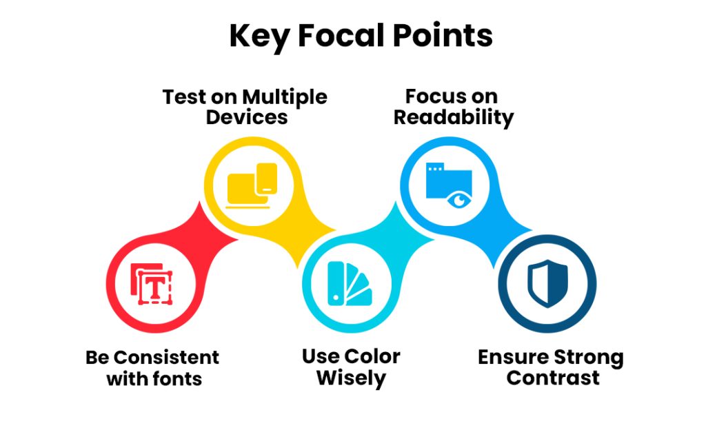
- Focus on readability. Use a basic legible font for body text, and make sure it’s large enough. A visitor is likely to leave the page if the text looks cramped or letters feel too thin.
- Ensure strong contrast. The text should sharply contrast with its background. A common guideline is to aim for at least a 4.5:1 contrast ratio for regular text. High contrast buttons or links will draw clicks naturally.
- Use color wisely. Use bold or warm colors for calls-to-action and special offers, to create urgency. Be sure to check that the color combo works for color-blind users.
- Be consistent with fonts. Use only two complementary fonts. This will provide your content with a clean, professional feel and also limit distraction.
- Test on multiple devices: Look at your site on mobile or desktop. Use tools or settings that simulate color-blind vision or dark mode to make sure everything delivers clarity. Remember that contrast and simplicity are even more important on small screens.
Conclusion
In e-commerce, color contrast and typography are more than inconsequential details. The best combinations help communicate product information, accentuate the purchasing journey, and enhance the branding of your company. Readable fonts, coupled with high-contrast colors, deliver a more seamless, or enjoyable, experience for all visitors, and let’s face it, an online retailer wants to enhance the visitor’s experience. Good typography and color options do more than just look good, they also increase the likelihood that your visitor will find what they are looking for quickly, and they will trust your brand.